Catalogue for the art show of Claudio Verna at Kappa-Nöun exhibition space.

Catalogue, 23.5×16.5 cm
24 pages
Front and back cover dialogue
with each other in a play of
graphic and colour symmetries.
2019 © Nicola-Matteo Munari

A detail showing the cover
and the title page.
Ph. © Nicola-Matteo Munari
and the title page.
Ph. © Nicola-Matteo Munari

The typographic modular grid
system that has been designed
in order to structure the layout.
2019 © Nicola-Matteo Munari
system that has been designed
in order to structure the layout.
2019 © Nicola-Matteo Munari
The catalogue designed for the exhibition Cromoracconto—meaning ‘a colour story’—is dedicated to the works of Italian artist Claudio Verna (1937), a master of Analytical Painting, who, on this occasion, exhibited about ten paintings ranging from early 1970s to 2019.
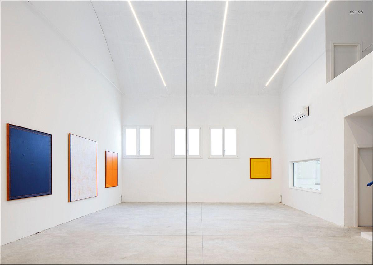
Cromoracconto is the first exhibition organised by Bologna’s art collector Marco Ghigi, who, after a long time spent buying works of great artists—among which Jannis Kounellis, Carl Andre and Matt Mullican—has decided to open his collection to the public through a series of monographic exhibitions.
 2019 © Nicola-Matteo Munari
 2019 © Nicola-Matteo Munari
 2019 © Nicola-Matteo Munari
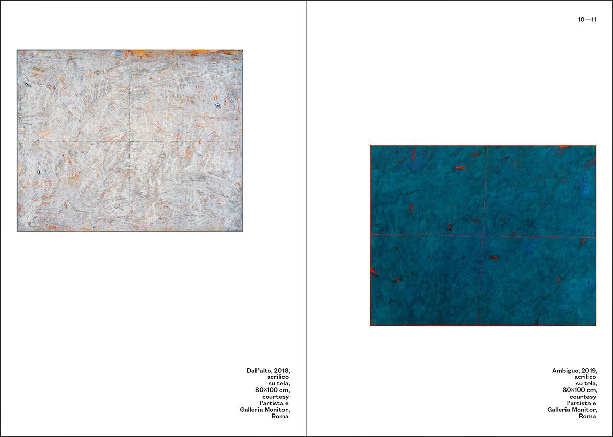 2019 © Nicola-Matteo Munari
The paintings of Verna, that despite appearances are anything but monochromatic, are mainly characterised by the graphical impact of their large coloured backgrounds and the vibrant colours. In this way, they vigorously stand out from the white walls of the exhibition space as well as on the white pages of the catalogue.
The entire composition of the catalogue has been structured on a typographic modular grid featuring a double matrix, that allowed to arrange the reproduction of artworks in such a way as to establish calibrated geometric relationships between images, also creating an articulated visual dialogue that develops page after page.
 Ph. © Nicola-Matteo Munari
 Ph. © Nicola-Matteo Munari
 “The colours of Verna’s paintings are somehow uncatchable. They are characterised by a perpetual instability, even when they tend towards the quasi-monochrome. They can’t be fixed in a single image.”
Davide Ferri
From the Foreword
From the Foreword
Like images, also titles and texts have been arranged according to the rhythm determined by the grid’s modularity, slowly sliding up and down onto the pages.
In this way, although the contents reproduced in the catalogue are not so many, texts and images seem to lively chase each other, generating a dynamic sequence that looks spontaneous, despite it was actually carefully calibrated in all the details.
 2019 © Nicola-Matteo Munari
 2019 © Nicola-Matteo Munari
 2019 © Nicola-Matteo Munari
 2019 © Nicola-Matteo Munari
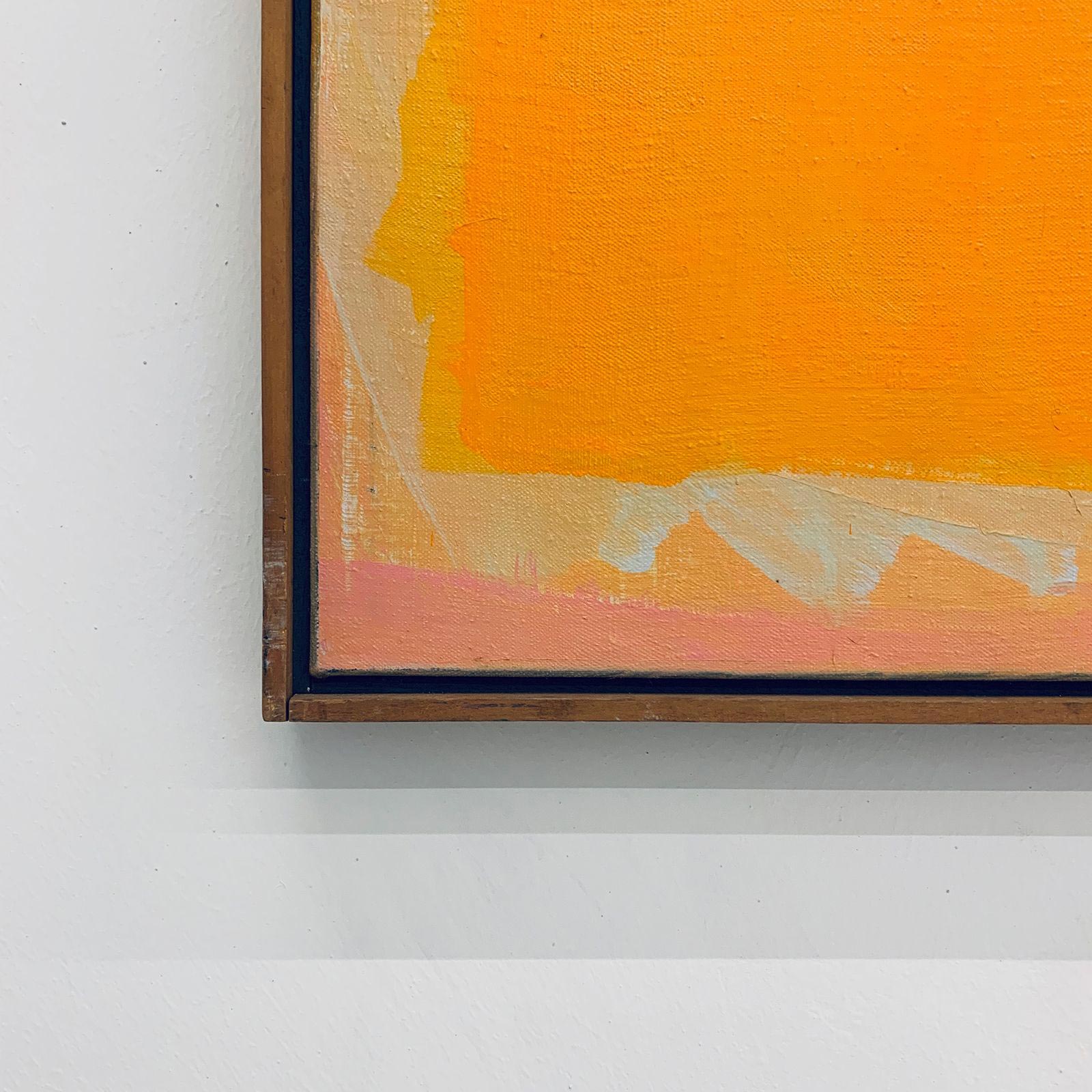
The cover of the catalogue plays with one of the main artworks exhibited in the show—a large square orange painting featuring a sort of “cut” on its vertical axis.
The left half of the painting has been reproduced on the right half of the front cover, while the right half is reproduced on the left of the inside, after the front cover. And again, the left half is reproduced on the right of the inside, just before the back cover, and the right half on the left half of the back.
In this way, a dialogue of symmetries and reflections generates a visual play on the cover, also with the contribution of the title—which is white and black, and then black and white.
Thanks to such a graphical solution, it becomes clear to the reader that the cover is not just the front one, but that it flows from the front to the inside, onto the back.

Detail of the painting reproduced
on the cover, titled ‘The tent of Gengis Kahn’ (1980).
Ph. © Nicola-Matteo Munari
on the cover, titled ‘The tent of Gengis Kahn’ (1980).
Ph. © Nicola-Matteo Munari
 Ph. © Nicola-Matteo Munari
 Ph. © Nicola-Matteo Munari
Detail of the front cover
and the title page.
Ph. © Nicola-Matteo Munari
and the title page.
Ph. © Nicola-Matteo Munari
The design of the catalogue has been conceived in order to quietly valorise the aesthetic qualities of the artworks.
Through generous white space, a lively composition, and unpretentious but legible typography, it was possible to produce a catalogue which is fresh and spontaneous in the layout, but that is also clear and pleasing in the reading.
—Nicola-Matteo Munari
Client
Kappa-Nöun
Design+Layout
Nicola-Matteo Munari
Photo
Carlo Favero
Project Date
2019
Kappa-Nöun
Design+Layout
Nicola-Matteo Munari
Photo
Carlo Favero
Project Date
2019

