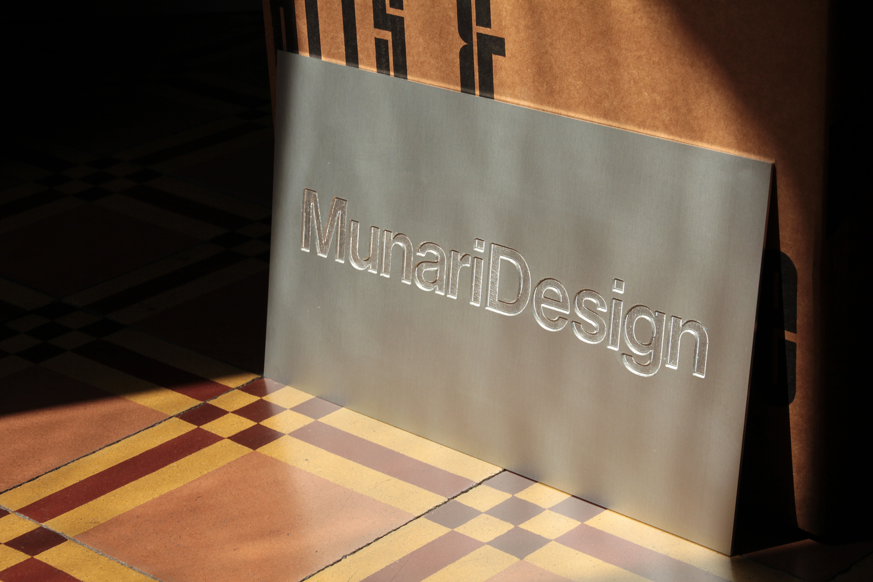
The logotype of our studio.
 2014 © Nicola-Matteo Munari
 Ph. © Nicola-Matteo Munari
Detail of the facade of the studio
with the logo on the windows.
2021 © Nicola-Matteo Munari
with the logo on the windows.
2021 © Nicola-Matteo Munari
 Ph. © Nicola-Matteo Munari
The logo of MunariDesign is a typographic logo—therefore a logotype—made of plain typographic letters that were the object of a careful spacing and reshaping intervention.
The two words forming the name of the studio were put very close to each other, thus generating greater visual unity—one word for one logotype.
Typically, there is the habit of having a symbolic trademark a priori, without even questioning its actual need. But if it’s true that in visual communication a symbol could always be useful, it’s not always necessary.
In this case, the absence of a symbol is intentional because considered unnecessary, thus giving more importance to the logotype and reflecting the particular typographic approach towards graphic design that is representative of the work of MunariDesign.
Also, the choice of focusing on to what is strictly necessary, emphasising what is essential, represents a typical attitude of MunariDesign.
While the shape of the typeface, which is plain and simple, recalls the typical typographic grammar of Modernism, thus evoking a sense of belonging to its cultural roots.
Since its introduction, the logotype has been effectively used across many scales and reproduced with various printing techniques on paper, vinyl decals, metal signs, etc.
—Nicola-Matteo Munari
Client
MunariDesign
Design
Nicola-Matteo Munari
Project Date
2014
MunariDesign
Design
Nicola-Matteo Munari
Project Date
2014

